Satellite maps are just one of the tools available to recreational fishers, but a little bit of time learning to interpret the maps will pay off in fuel usage. In this example, I use Waihau Bay on the east coast North Island of New Zealand to illustrate their use. Which maps you use will depend on the conditions. In this case, I use the SST, mixed layer depth, chlorophyll, and bathymetry maps. Without going into too much detail about the dynamics, lets take a look at what the structure shows you about where to target your fishing effort.
As a first step, it’s important to look at the setup. Use the 4-day maps for this. These are best viewed on a computer because the screen is larger so you don’t have to scroll around to see all 4 maps at once.

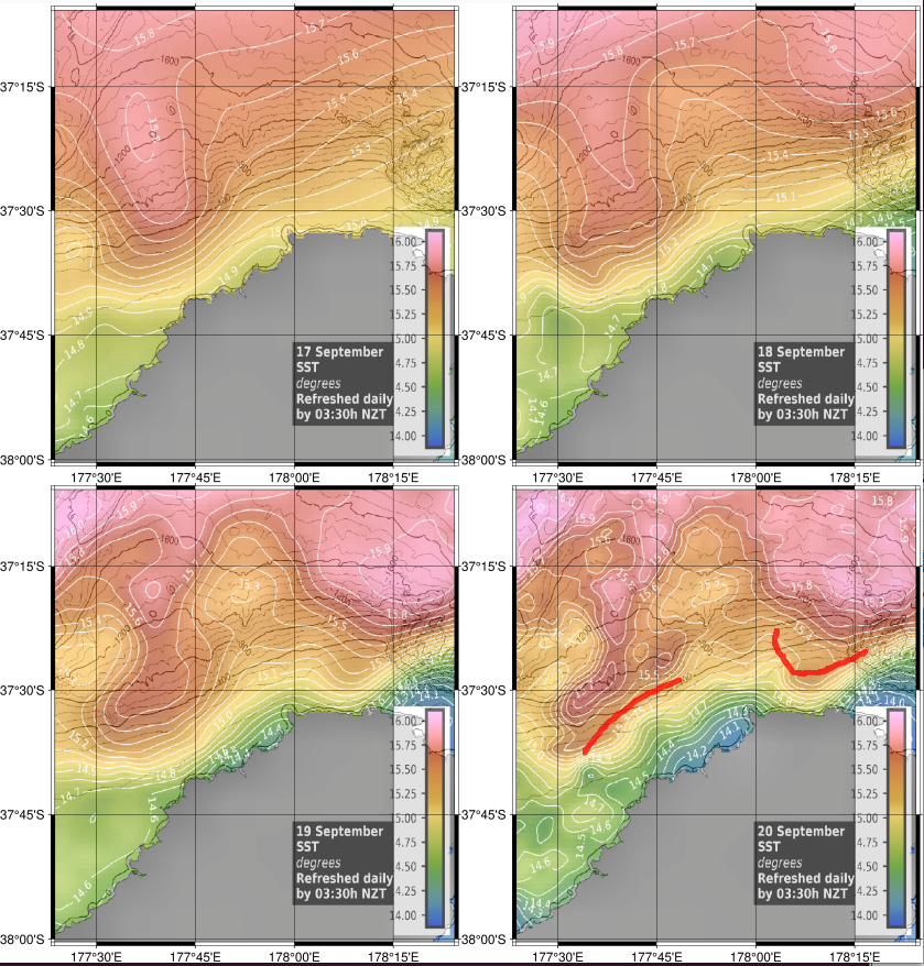
In this case, all four days show a wave-like pattern of 15.8 degree C warm water intruding from offshore toward the coast. This is evident over all 4 days, but the strength of the temperature breaks is also increasing over time. You can see this because the white lines of temperature contours are tighter-spaced on the most recent day compared to the previous days (Figure 1). To make the rest of the analysis easier, it is helpful to mark the areas with good water temperature contrast and strong temperature breaks. This is shown by the red lines in Figure 1.
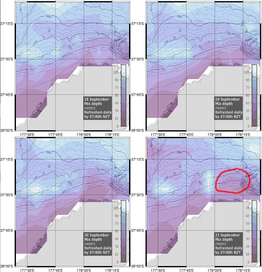
Next let’s look at the mixed layer depth (Figure2). I explained the relationship between mixed layer depth, water column stratification, and productivity in an earlier blog. A take home point from that blog was “Areas of shallow mixed layer that have persisted for at least four days to a week are likely to be feeding areas for the large pelagic fishes like dorado, tuna, and marlin.”

You want to look for those stable areas that overlap with the favourable SST region marked up in Figure 1. The shallower mixed layer areas are coloured purple in Figure 2. The red circle shows that area where the mixed layer has been shallower over the last 4 days and overlaps with with one of the favourable SST regions marked in Figure 1. Actually, both marked SST areas overlap with shallower mixed layer depth, so why did I only mark the eastern one?
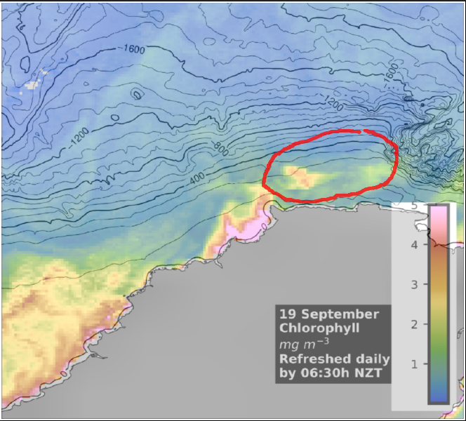
To answer that question you need to look at the chlorophyll map. Most of the chlorophyll maps were obscured by cloud, but one of the 4 days was clear (Figure 3). Phytoplankton turn over every couple of days, so chlorophyll, which is an indicator of phytoplankton, builds up in patches that persist for several days to a week. You don’t need the very recent chlorophyll image to see where there are patches of chlorophyll. If we look for locations where there are favourable water temperature contrasts and strong temperature breaks (marked in Figure 1), as well as shallow mixed layer depth (circled in Figure 2) that overlap with patches of chlorophyll transitioning to blue water, this is found where I’ve put a circle in Figure 3. This pretty much puts the best fishing zone off Lottin Point.

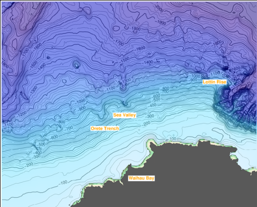
The final step is to look at the bathymetry to determine if there are any features in this region that might be attractive to fish. Those features might be drop offs, a steep shelf edge, canyon heads, sea mounts or knolls, or just rough topography that will increase mixing rates. If you look at the map for this region, it is obvious that the key bathymetric feature is a steep shelf edge (Figure 4). Small baitfish called mesopelagic fishes tend to line up along shelf edges like these, providing a readily accessible food source for large pelagic fishes like tunas (and marlin later in the season).

The shelf drops steeply from 200 metres to 1,000 metres off Lottin Point. The 200 to 400 metre depth contour lines fall squarely within the regions marked on the SST, mixed layer, and chlorophyll maps. This defines an accessible and promising zone to target.
